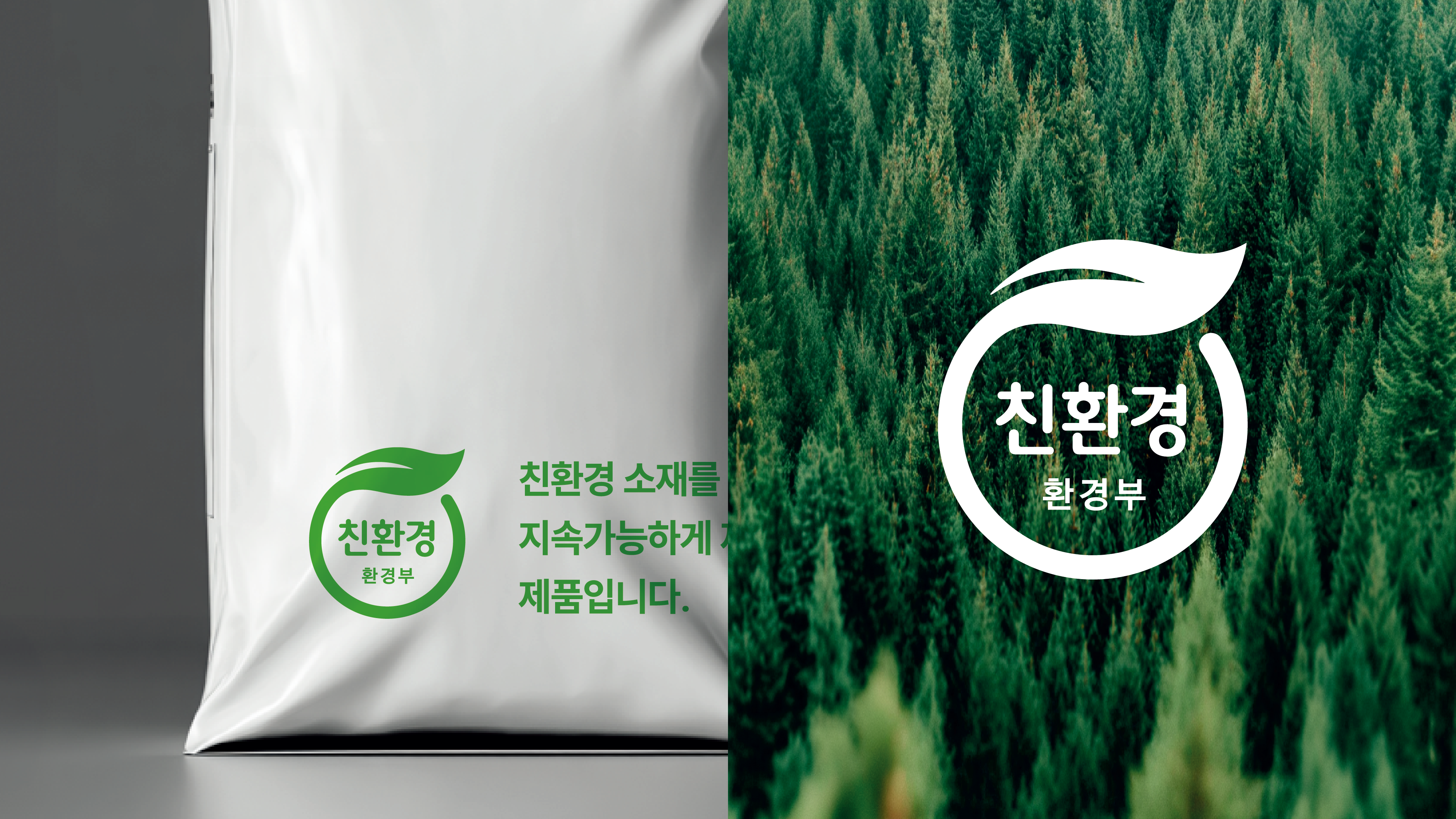
자연과 지구를 보호하는 환경통합인증마크
Environmental Integrated Certification Mark
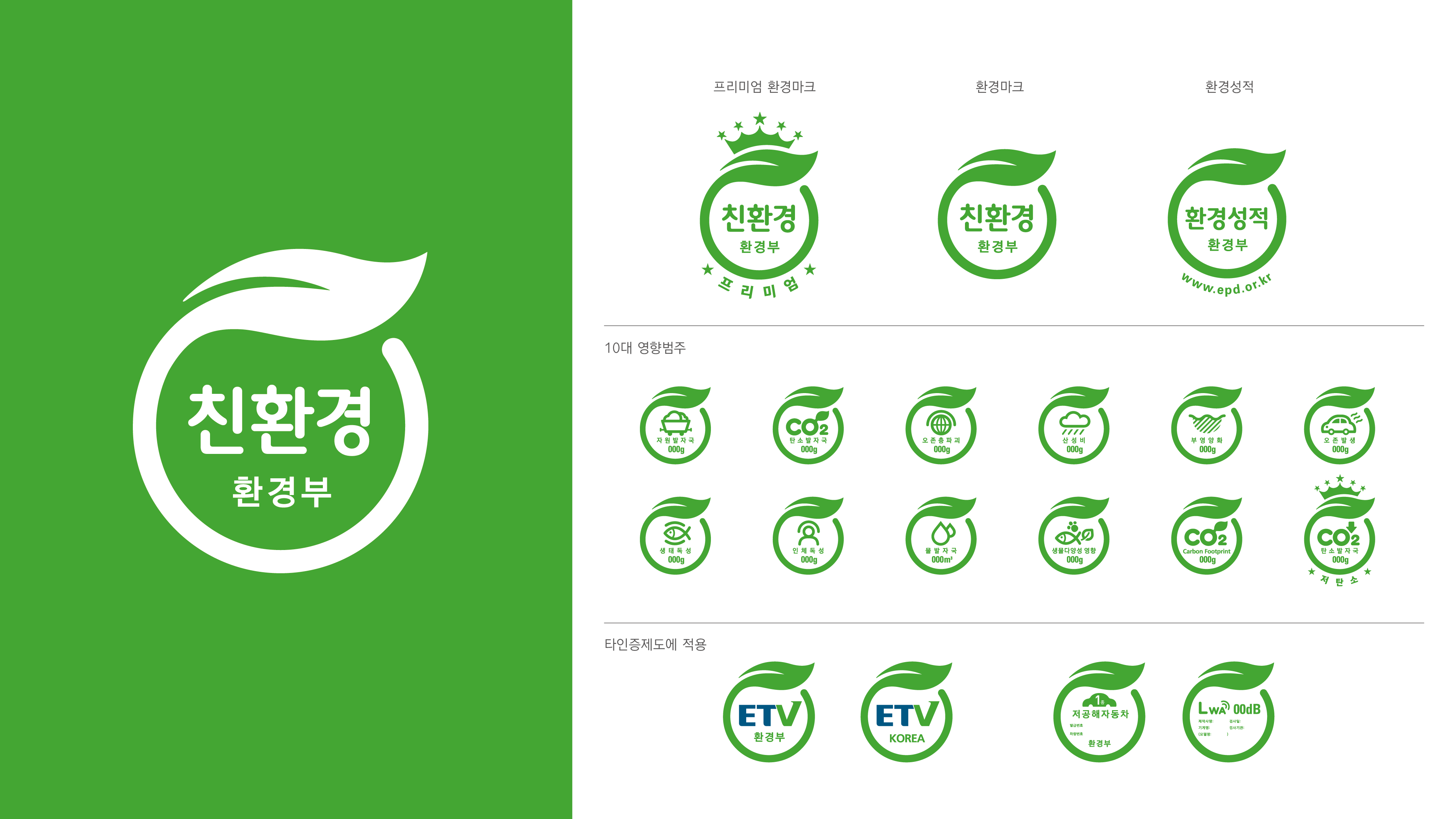
환경통합인증마크가 개발되기 전까지 안전, 보건, 환경, 품질 등 각 분야별 필요에 의해 만들어진 다양한 인증마크가 존재했습니다. 환경통합인증마크 개발을 통해 소비자들의 혼란을 초래하는 수많은 인증마크를 통합하여 정리하고, 정부가 운영하는 환경분야의 대표 인증제도를 만들어 신뢰도와 대국민 인지도를 높이고자 하였습니다.
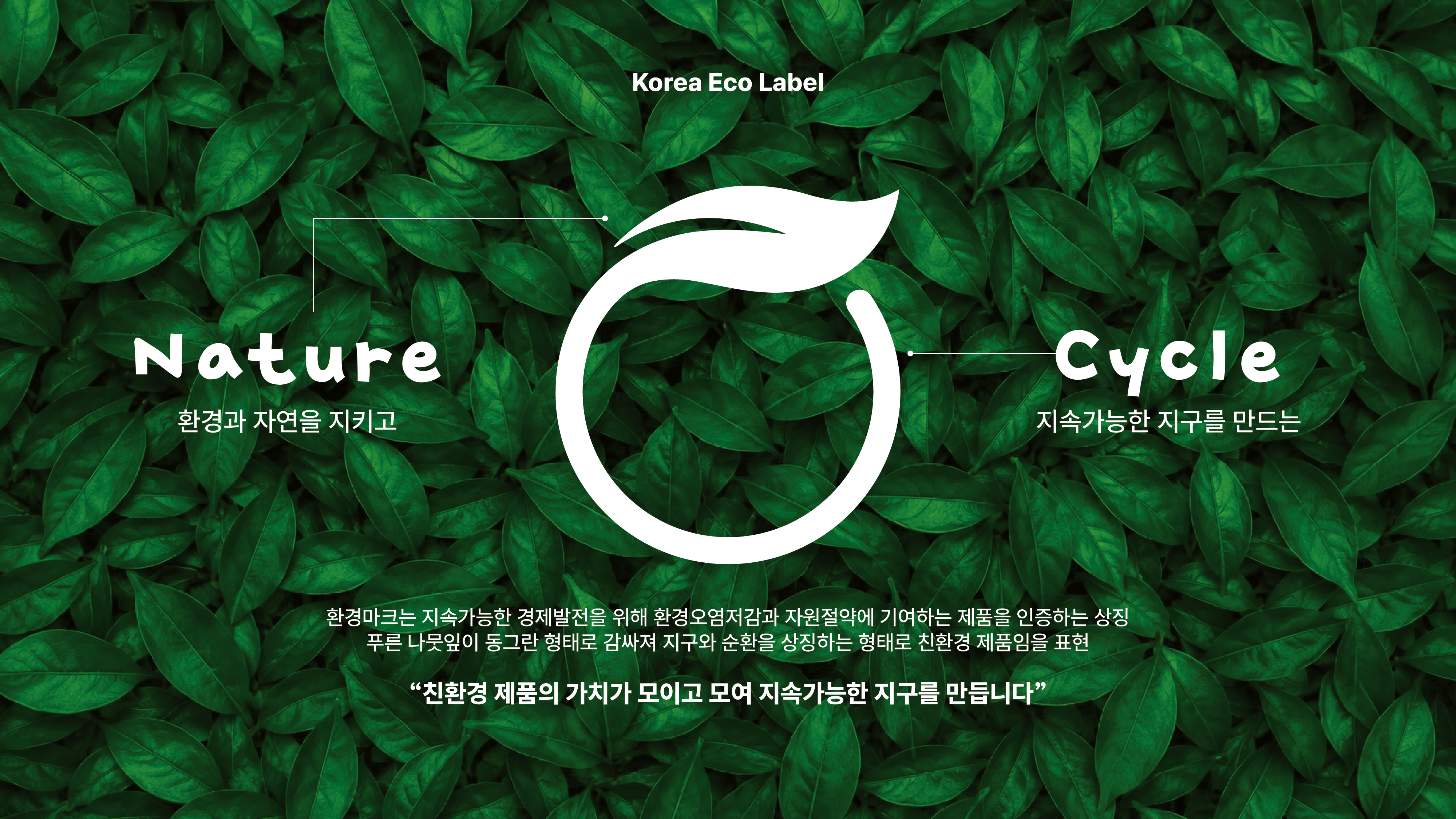
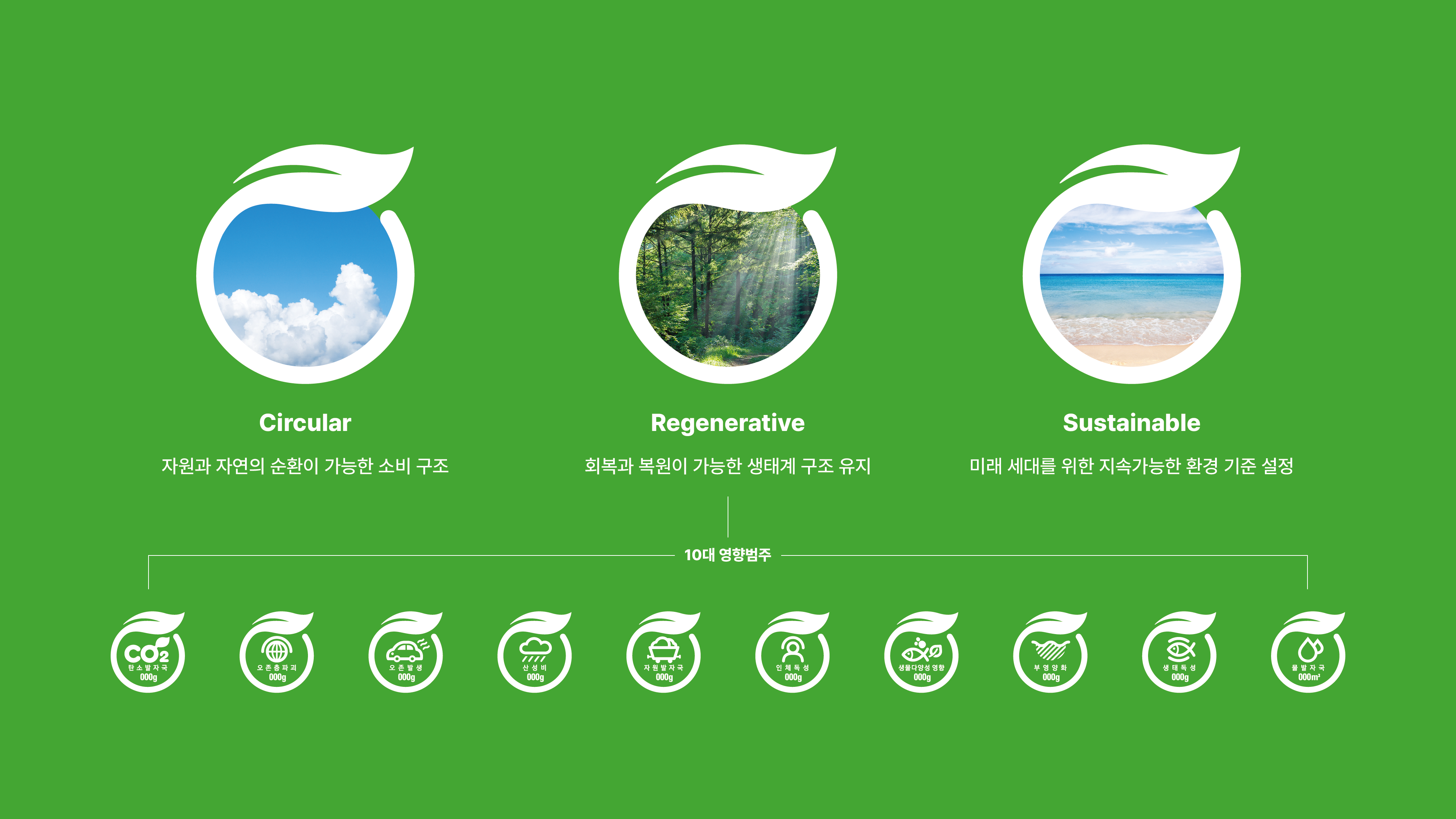
환경마크는 통합로고로서 대표성을 부각하기 위해 환경성을 상징하는 대표적인 연상 이미지로 표현했습니다. 푸른 나뭇잎의 이미지는 그 자체로 친환경 이미지를 대변하며, 푸른 나뭇잎이 동그란 형태로 감싸지는 형상은 지구를 지키는 친환경 제품임을 나타냅니다. 또한 원형의 이미지는 ‘친환경 제품의 가치가 계속적으로 이어져 지속가능한 사회를 만드는 밑거름이 된다’는 메시지를 전달합니다.
Before the development of the Environmental Integrated Certification Mark, a wide range of certification marks existed across different sectors, including safety, health, environment, and quality. Through the development of the Environmental Integrated Certification Mark, these numerous certification marks — which had caused confusion among consumers — were consolidated and organized, with the aim of establishing a government-operated representative environmental certification system that could enhance reliability and public awareness.
The Environmental Mark was designed using a representative visual image symbolizing environmental friendliness in order to emphasize its identity as an integrated logo. The image of the green leaf itself represents eco-friendliness, while the form of the leaf embracing a circular shape signifies environmentally friendly products that help protect the Earth. In addition, the circular image conveys the message that the value of eco-friendly products continues sustainably, becoming the foundation for a sustainable society.
Year⠀⠀2016⠀⠀⠀⠀⠀ Project⠀⠀환경분야 인증제도 통합로고 개발 연구⠀⠀⠀⠀⠀ Scope⠀⠀로고 디자인⠀⠀⠀⠀⠀ Client⠀⠀한국환경산업기술원