City of Chuncheon
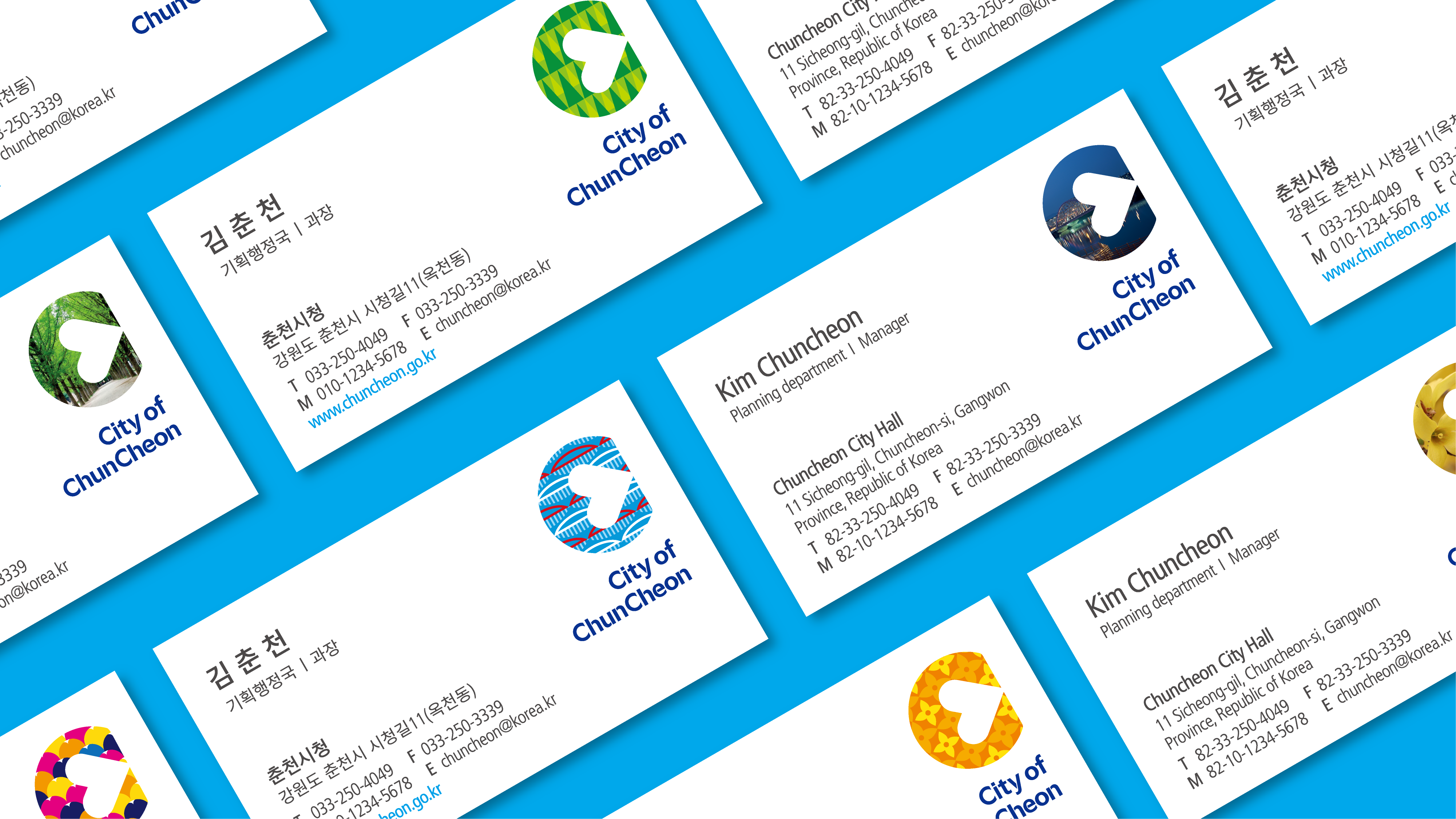
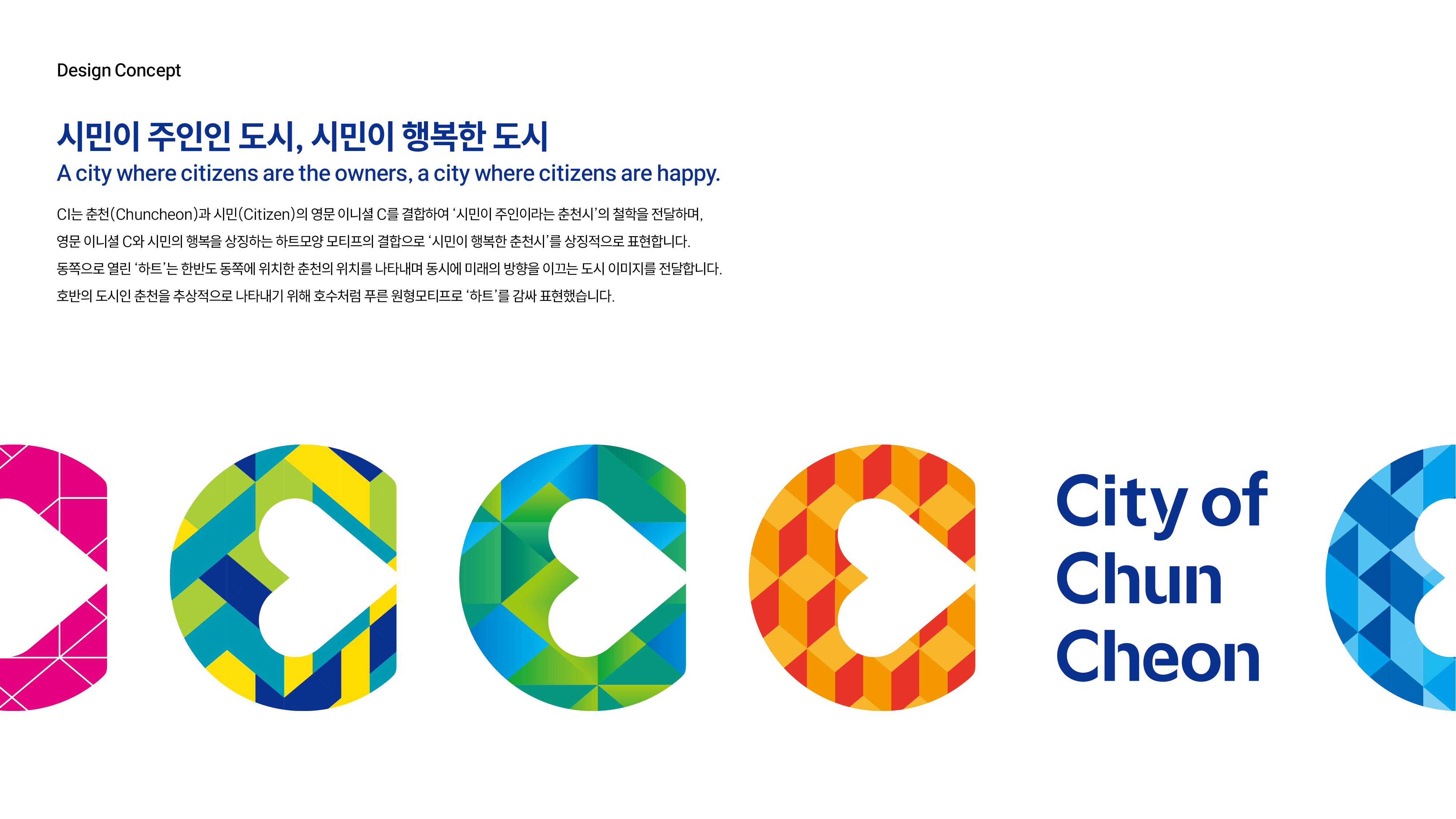
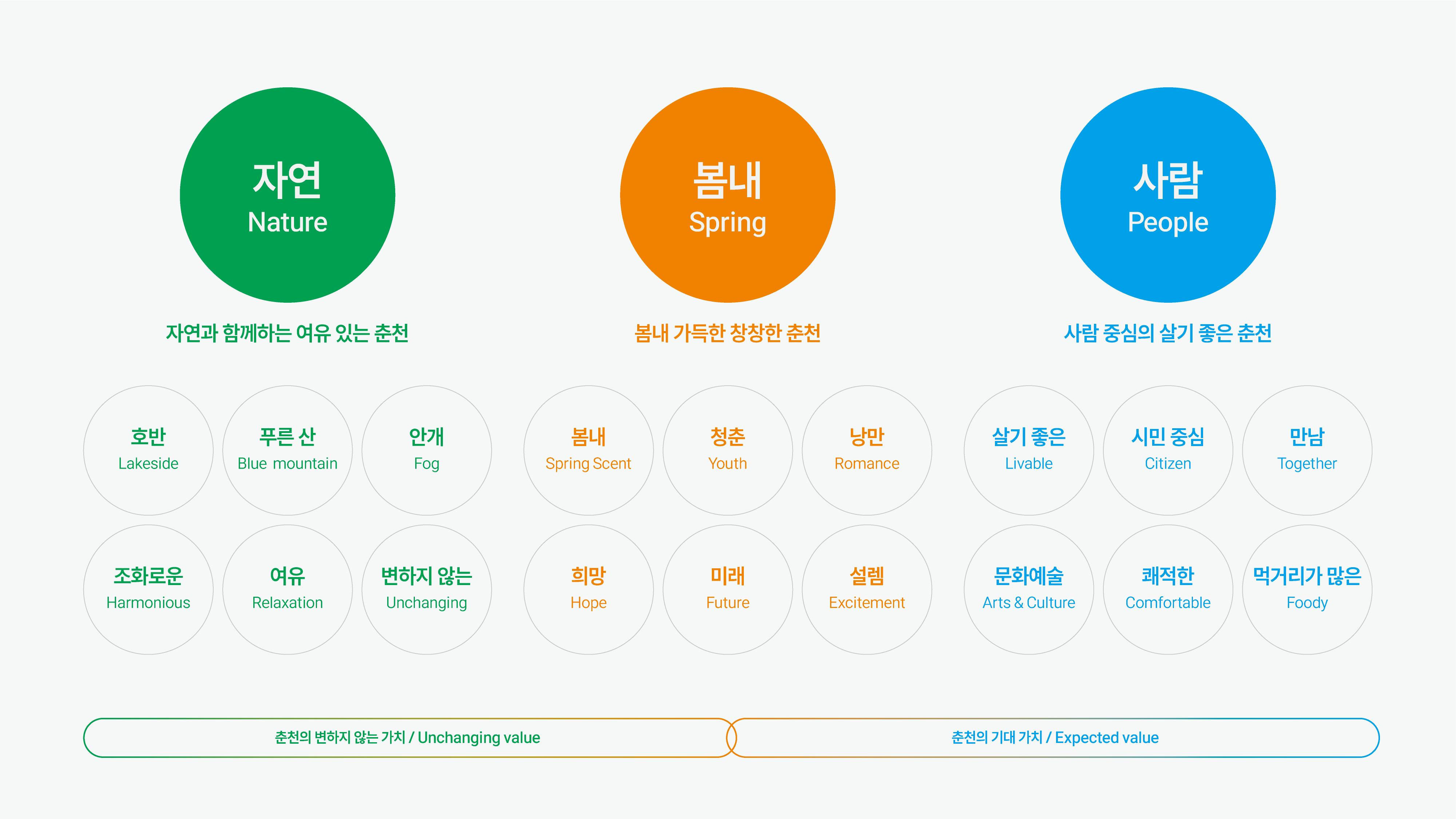
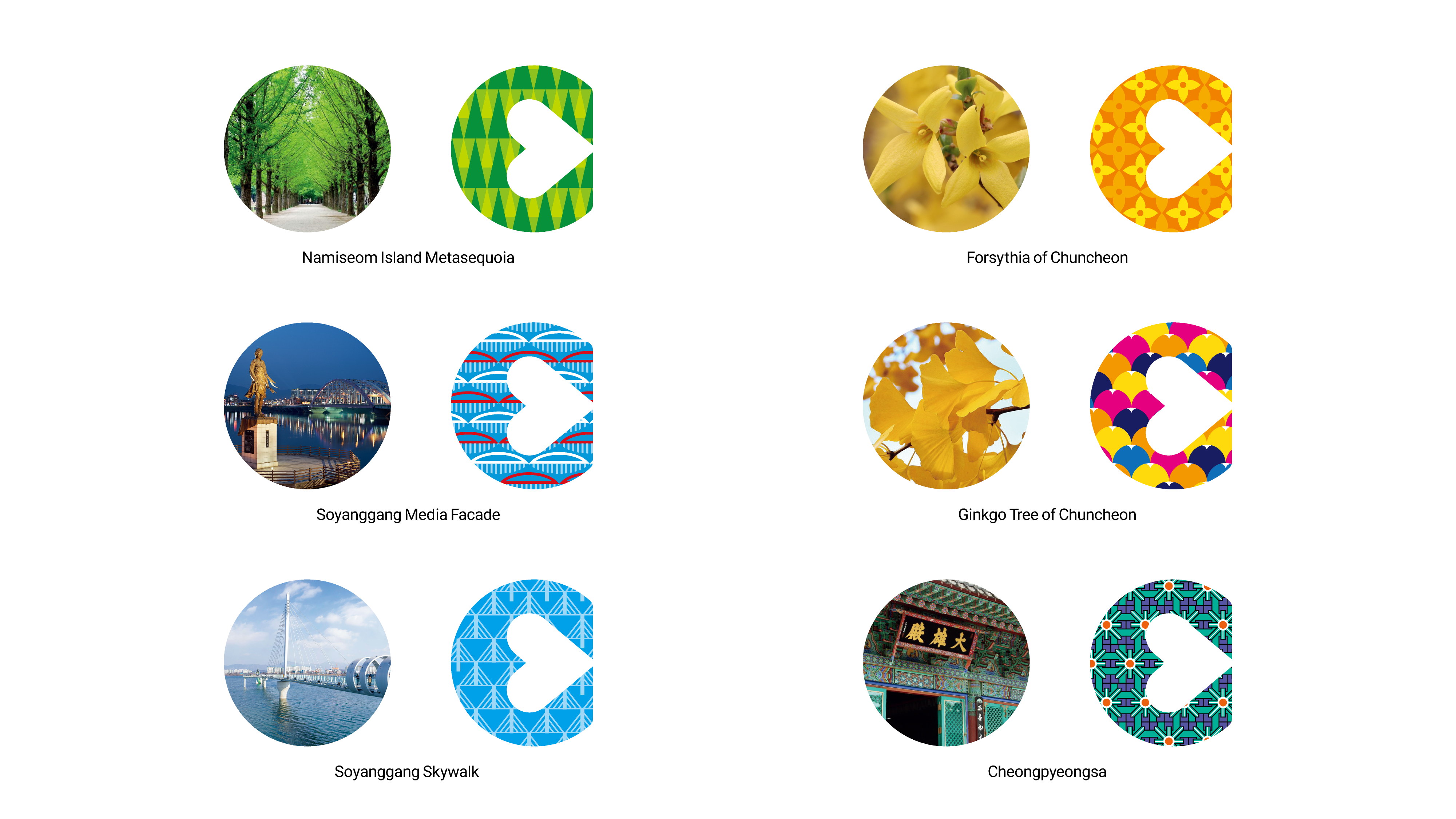
Chuncheon city has used the former symbol for 25 years. The passage of 25 years has made it difficult for the symbol to convey the current and future image of Chuncheon. In addition, the recently developed city slogan and characters were also biased toward past-oriented “romantic,” which clearly had limitations in their wide use. As building a unique image becomes important for modern cities, city brands are gradually evolving into a form that is easy to communicate. Moreover, as city brands are centralized, on the rise are flexible designs that are easy to apply to various contexts and expandable in different fields. Therefore, we carried out the rebranding with the strategy of developing a flexible design that can contain various images of Chuncheon City, delivering unique stories of Chuncheon City rather than universal and general images of the city.
Year 2020
Award Red Dot Design Award, Good Design Awards (USA), German Design Award, Design iT Award